Andrew Rossi

Creating and managing a scalable design system for Garmin Pilot across web and iOS.
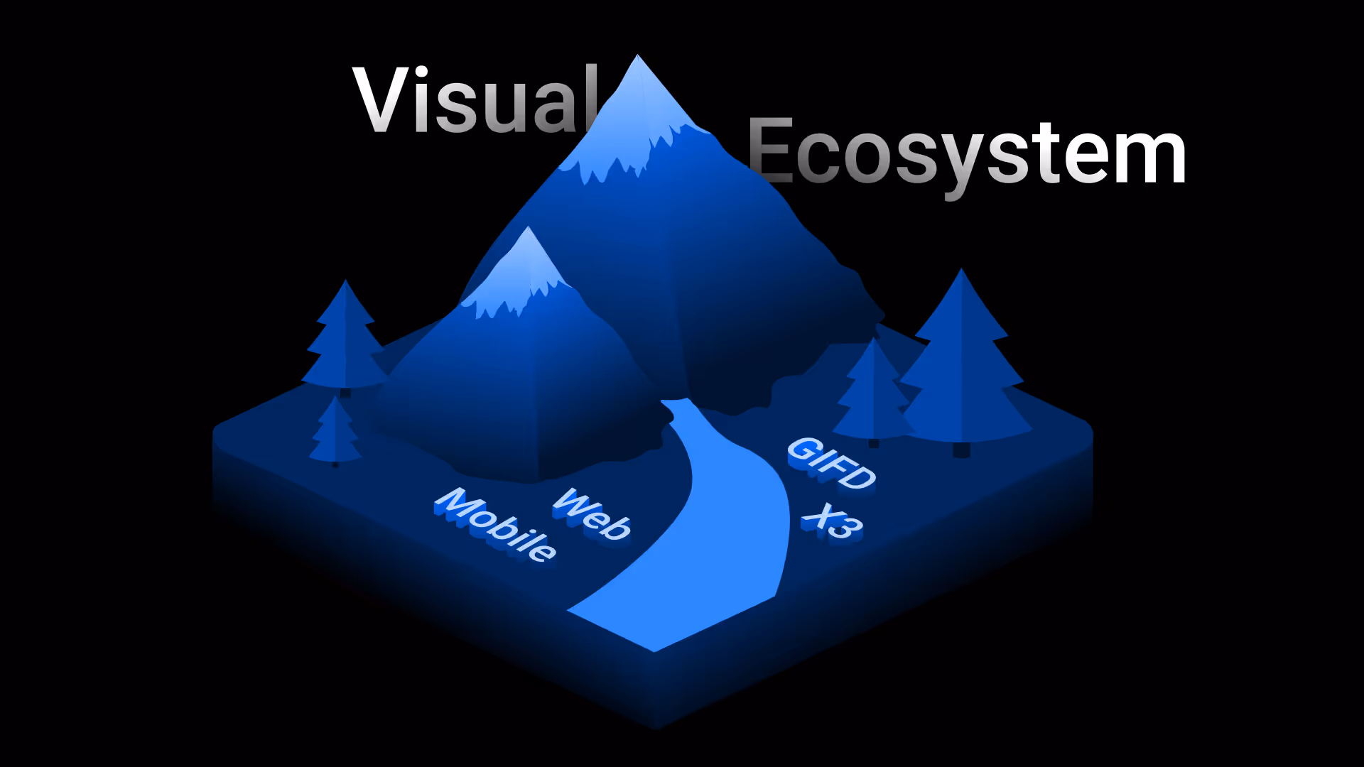
Design System
Web
iOS
Our web and iOS design systems are used on a daily basis, not because designers have to, but because they genuinely improve our workflow. By streamlining decision-making and reducing repetitive work, the system makes designing at Garmin faster, more consistent, and more enjoyable.
In Fall 2022, Garmin kicked off a new initiative: Garmin Pilot Web. I was the first designer assigned to the project and immediately took the lead in defining the visual direction.
After several iterations and a formal presentation, we received sign-off from executive leadership. I also took the initiative to create a design system, Garmin Aviation's first.
Through early exploration, I established our core visual foundations: color, typography, and spacing. Both color and typography drew direct inspiration from Garmin’s avionics systems to maintain brand alignment and familiarity.
I adopted the same font family and weight hierarchy used in our cockpit displays, and applied the avionics color philosophy to guide tone and contrast choices.
To ensure visual consistency across light and dark modes, I developed a global color system using the OKLCH color space. This allowed for more predictable contrast and hue consistency across shades, creating a modern, accessible palette that still felt true to our brand.


While dark mode was the default, supporting light mode was a requirement from day one. This shaped the development of the global color palette, as I needed to ensure a full range of accessible shades across both ends of the spectrum.
I also made a strategic decision to select a primary blue that meets contrast requirements in both modes. This allows the color to remain consistent across themes, resulting in a more harmonious and unified brand presence throughout the system.

Components were built using an atomic approach, with both designers and developers in mind. Each component follows a standardized structure, and goes through a consistent testing process before being published. This approach reduces ambiguity and allows the team to focus on solving user needs.
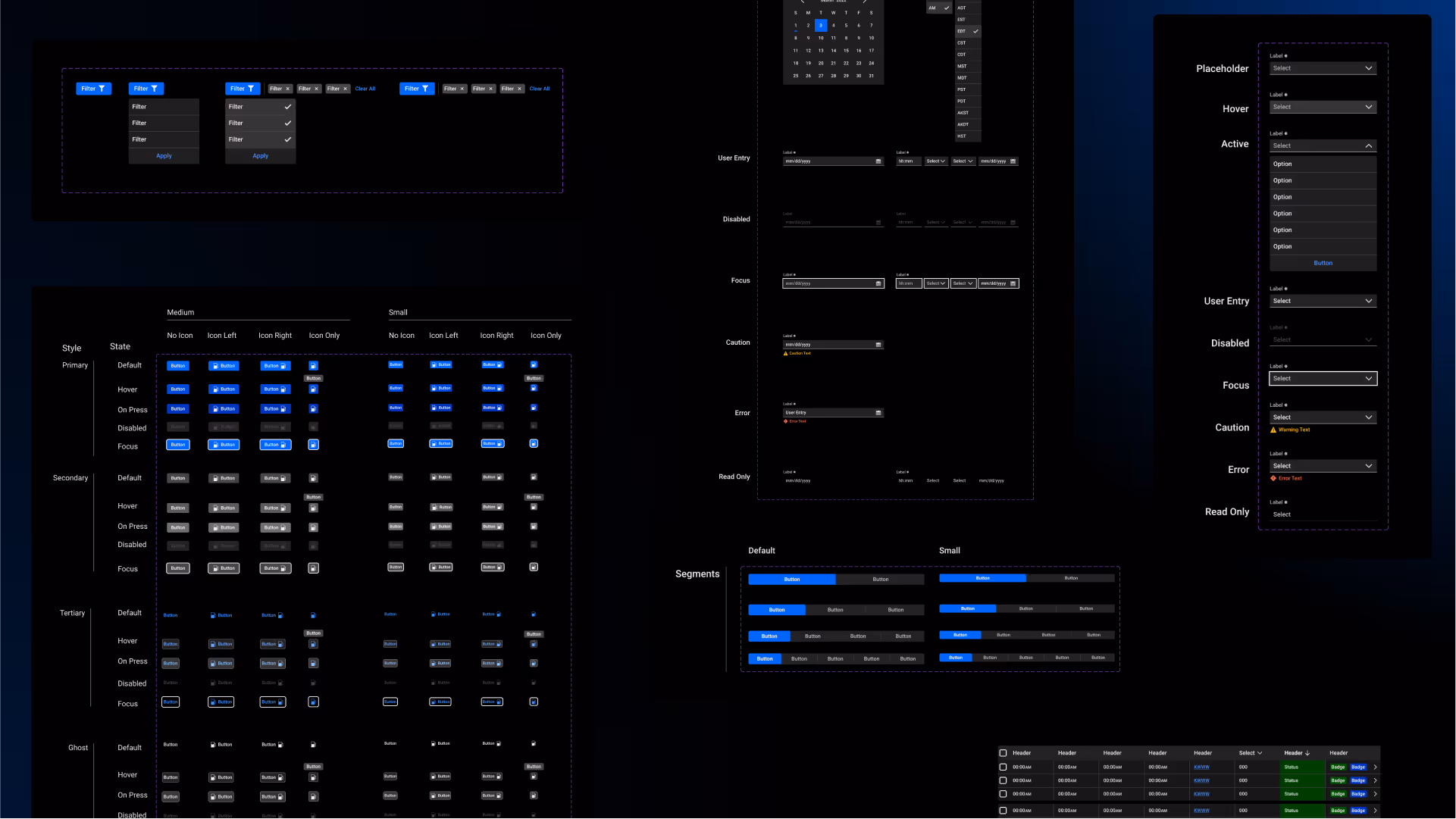

I created a 24px grid system to ensure consistency across icons, drawing inspiration from our avionics visual language. Every icon was custom-built using this grid.
To add visual interest to select pages, I also developed a cohesive illustration system with a modern aesthetic.

Building out design systems for both iOS and web taught me a lot. Here are a few key takeaways and highlights from the process.

To better integrate our custom icons across platforms, I learned how to create our own SF Symbols. These icons quickly became highly valued by our iOS developers thanks to their native support, scalability, and seamless integration within the Apple ecosystem.
Utilizing component slots was a game changer. It allowed designers to swap out content in modals and pop-ups without detaching components, giving them flexibility while maintaining styling. As a result, I reduced the number of detaches to virtually zero.

It may sound simple, but saving effects to the library styles was a crucial step in maintaining visual consistency. Whether for dividers, underlines, highlights, or dividing lines, using blurless drop shadows allowed us to apply consistent, tokenized styles across the system.
This eliminated the need for manually drawn lines in every mockup and gave the team a flexible, scalable way to implement strokes.

Our design systems are ultimately governed by myself, but contributions to the design system are collaborative. I work with designers, developers, and even leadership to understand their problem and offer the best solution. Updates are created as needed and communicated with designers and developers through review meetings.


While not the most glamorous part of a design system, documentation is essential. I created a flexible documentation template that can scale with the complexity of each component.
It provides clear, self-serve guidance for designers and developers, covering usage, behavior, states, and implementation details.
It was important to me that no one on the team felt left behind when adopting the new system. To support a smooth transition, I led a series of lunch-and-learn sessions covering the fundamentals of the design system, how to use and modify components, and best practices for building full interfaces across both web and iOS. These sessions helped build confidence, encourage adoption, and foster a shared understanding of system design.
(actual footage of me teaching)


Figma

Adobe CC


